Better Color Palette from One Primary Color
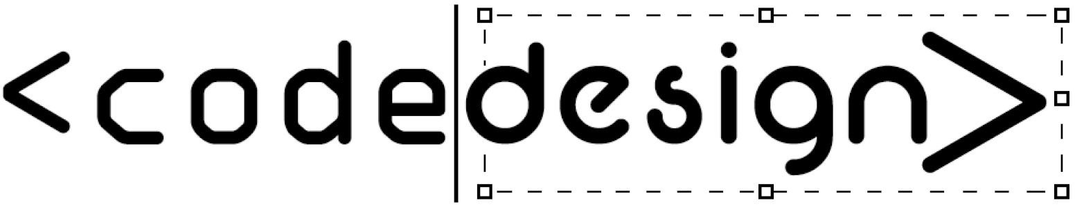
Build a Color Palette from One Primary Color Building a Consistent Color Palette from One Primary Color One of the most common UI/UX issues in web projects isn’t layout or typography—it’s inconsistent color usage. Random hex values for buttons, backgrounds, and hover states quickly make an interface feel unpolished. A simple way to avoid this is by working with a color system instead of individual colors. Using UI Colors to Generate a Color Scale http://uicolors.app/ is a lightweight tool that helps you generate a full color palette from a single primary color. You start with one brand color, and the tool creates: Lighter shades for backgrounds and subtle accents Mid-range shades for text, icons, and borders Darker shades for hover, focus, and active states Even though the tool labels the output as Tailwind colors, it’s not limited to Tailwind at all. What you’re really getting is a structured color scale that works in any web project. Why Color Scales Matter in UI/UX Using a defined color scale helps you: Maintain visual consistency across components Reduce design decisions during development Create predictable interaction states Improve accessibility and contrast control Instead of guessing which color to use for a hover state, you already know which shade comes next in the scale. Applying the Palette in Real Projects Once you have your color scale, you can apply it in different ways depending on your setup: Custom CSS: Define the colors as CSS variables and reuse them throughout your styles Design systems: Map the shades to components like buttons, cards, and alerts WordPress projects: Add the colors as global styles (including in tools like Elementor) so they stay consistent across pages The key idea is that the palette becomes part of your system, not just a visual choice. Final Thoughts Good UI rarely comes from adding more styles. It usually comes from better structure and fewer arbitrary decisions. Starting with a single primary color and expanding it into a full palette is a small step, but it can have a big impact on the clarity and maintainability of your UI. If you’re building for the web, thinking in systems—even for something as simple as color—will always pay off.
Make Your Featured Projects Section Actually Stand Out
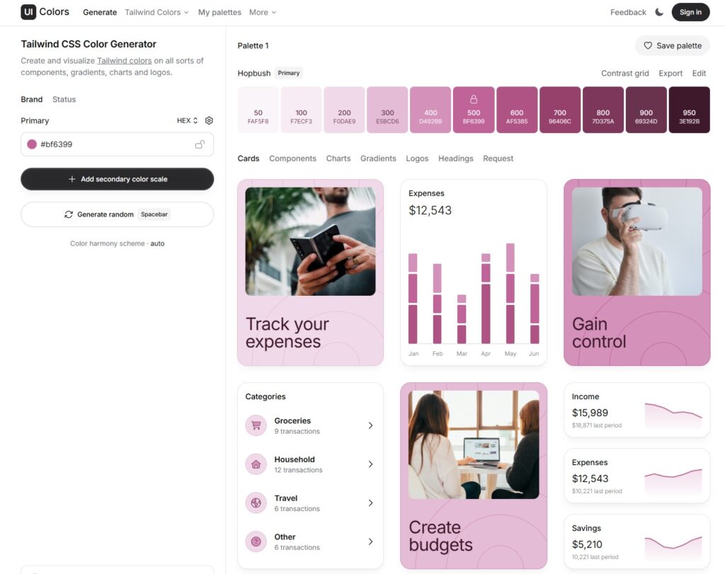
Make Your Featured Projects Section Actually Stand Out Better Featured Projects Section Make Your Featured Projects Section Actually Stand Out Without Additional Plugins I recently redesigned a Featured Projects section using Elementor Loop Grid, Advanced Custom Fields, and a bit of custom CSS to make it feel more intentional, interactive, and visually engaging. For this Featured Projects section, the goal was to keep the content flexible while giving it a more distinctive visual treatment than a standard grid. Here’s a quick breakdown of how it was built. 1. Creating the Project Posts with ACF I started by creating the project entries using Advanced Custom Fields (ACF). Each project includes structured fields such as: Project name Tag Location Featured image Using ACF keeps the content clean, reusable, and easy to manage—especially when scaling the number of projects later. 2. Building the Layout with Elementor Loop Grid Once the fields were in place, I added an Elementor Loop Grid widget and connected it to the project post type. The layout was designed directly inside Elementor, focusing on: Clear hierarchy Consistent spacing A compact, scannable card structure Loop Grid Template Layout(See Structure and Analyze) 3. Adding Numbers to the Bullet Points with JavaScript To add numbered indicators to the bullet points, I used a small JavaScript snippet. This script dynamically assigns numbers based on the item index, which keeps everything automatic and avoids hardcoding values. This approach ensures: No manual updates when items are added or removed Cleaner markup Better long-term maintainability 4. Styling the Bullet Points with CSS Finally, I applied custom CSS directly to the Loop Grid widget to transform the bullet points into horizontal bars and position the numbers correctly. Most of the styling work focused on: Turning standard bullets into visual bars Aligning the numbers for better readability Keeping the design subtle but noticeable The full CSS code is included below so you can adapt it to your own layouts. Final Thoughts Combining ACF for structured content, Elementor Loop Grid for layout, and light JavaScript + CSS for enhancements makes it easy to build sections that feel custom without overengineering. Small details—like numbering, spacing, and visual cues—go a long way in making a section feel intentional and polished.
iThryv

Website Design + Build
WCG Finance

Website Design + Build
Figma Web Design – iThryve
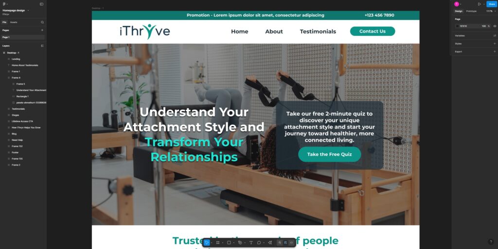
Web Design iThryve Figma Web Design
Better Alignment of Uneven Elements
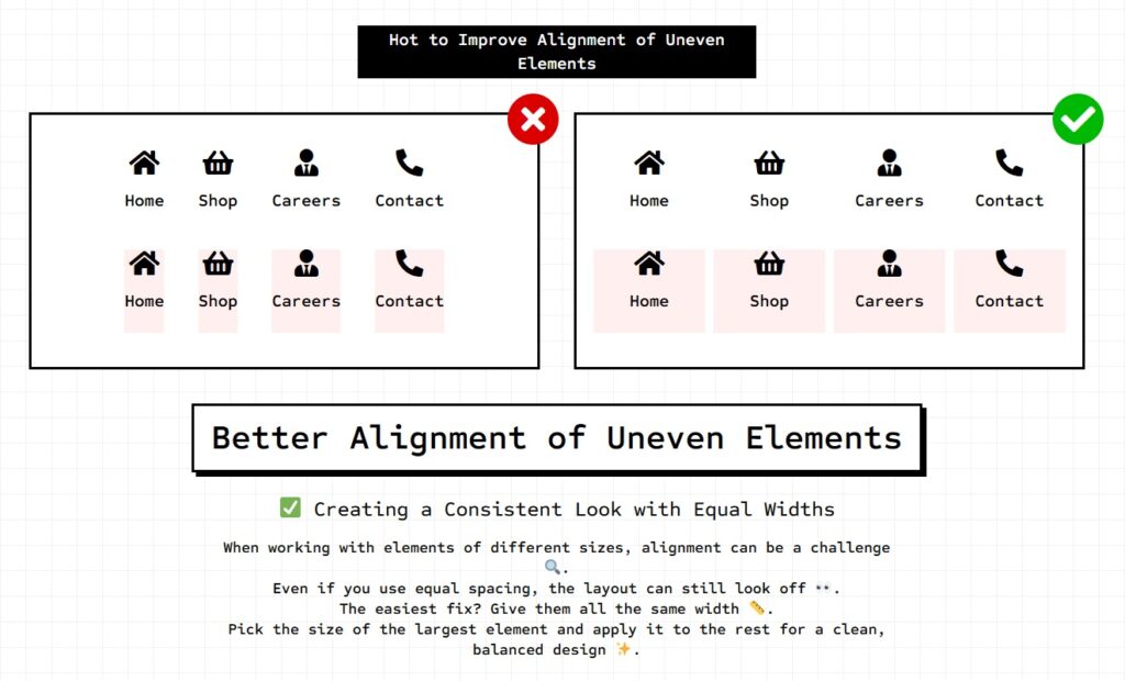
How to Improve Alignment of Uneven Elements Home Shop Careers Contact Home Shop Careers Contact Home Shop Careers Contact Home Shop Careers Contact ✅ Creating a Consistent Look with Equal Widths When working with elements of different sizes, alignment can be a challenge 🔍.Even if you use equal spacing, the layout can still look off 👀.The easiest fix? Give them all the same width 📏.Pick the size of the largest element and apply it to the rest for a clean, balanced design ✨. 🔥 Pro ELEMENTOR Tip: Perfectly Align Columns in Elementor with Flex Settings Want a sleek horizontal layout with equal-width items? Try this Elementor hack: 1️⃣ Set your Container Direction to Row (Horizontal) ➡️2️⃣ Switch Wrap to No Wrap 🚫3️⃣ Adjust the Columns Gap for perfect spacing 📏4️⃣ Set each element’s Width to 25% if there are 4 elements(100/number of elements) for four equal columns 🔥 ✅ Result: A clean, responsive design that looks amazing without extra widgets or complicated settings. ✨ Bonus Tip: Need 3 columns? Set width to 33.33%. Need 5? Go for 20%! 🎯 Home Shop Careers Contact Home Shop Careers Contact
Kelman Electric
Website Build
Top Notch Tampa
Website Build
The Window Design Studio
Website Build
The Custom Shade
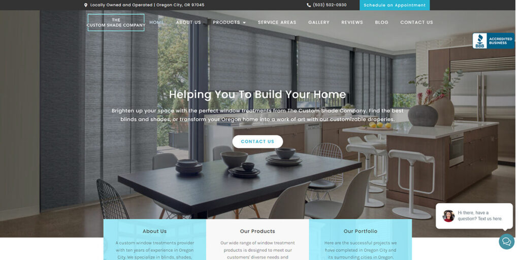
Website Build