
Build a Color Palette from One Primary Color
Building a Consistent Color Palette from One Primary Color
One of the most common UI/UX issues in web projects isn’t layout or typography—it’s inconsistent color usage. Random hex values for buttons, backgrounds, and hover states quickly make an interface feel unpolished.
A simple way to avoid this is by working with a color system instead of individual colors.
Using UI Colors to Generate a Color Scale
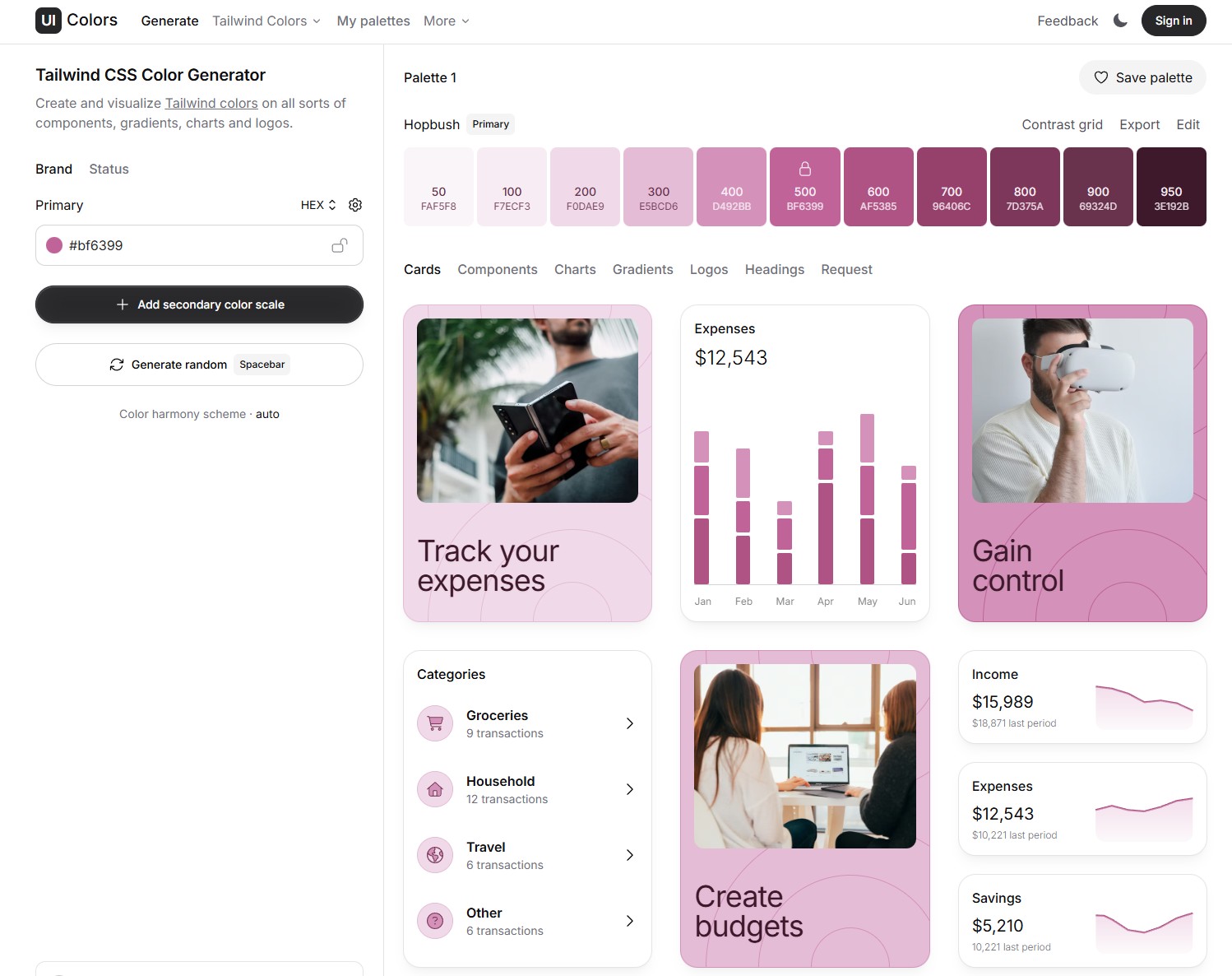
http://uicolors.app/ is a lightweight tool that helps you generate a full color palette from a single primary color.
You start with one brand color, and the tool creates:
Lighter shades for backgrounds and subtle accents
Mid-range shades for text, icons, and borders
Darker shades for hover, focus, and active states
Even though the tool labels the output as Tailwind colors, it’s not limited to Tailwind at all. What you’re really getting is a structured color scale that works in any web project.
Why Color Scales Matter in UI/UX
Using a defined color scale helps you:
Maintain visual consistency across components
Reduce design decisions during development
Create predictable interaction states
Improve accessibility and contrast control
Instead of guessing which color to use for a hover state, you already know which shade comes next in the scale.
Applying the Palette in Real Projects
Once you have your color scale, you can apply it in different ways depending on your setup:
Custom CSS: Define the colors as CSS variables and reuse them throughout your styles
Design systems: Map the shades to components like buttons, cards, and alerts
WordPress projects: Add the colors as global styles (including in tools like Elementor) so they stay consistent across pages
The key idea is that the palette becomes part of your system, not just a visual choice.
Final Thoughts
Good UI rarely comes from adding more styles. It usually comes from better structure and fewer arbitrary decisions.
Starting with a single primary color and expanding it into a full palette is a small step, but it can have a big impact on the clarity and maintainability of your UI.
If you’re building for the web, thinking in systems—even for something as simple as color—will always pay off.